Maps in Power BI offer powerful tools for visualizing and analyzing geographical data, making
presentations more engaging and informative. Users can create compelling visuals that enhance data-driven storytelling by leveraging its features
High level resolution steps
- Adding a “Basic Map” from set of visualizations.
- Adding a “Filled Map” from set of visualizations.
Detailed resolution steps
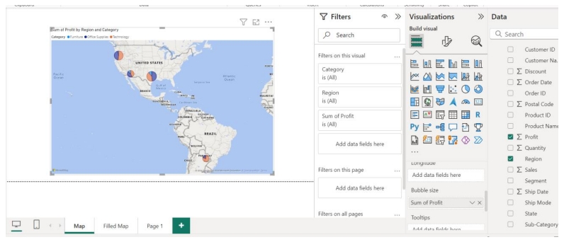
Step 1: Select the “Map” from the visualization pane and select the verticals as per below:
“Location” → “Region”
“Legend” → “Category”
“Bubble Size” → “Profit” to show the profit based on bubble size.
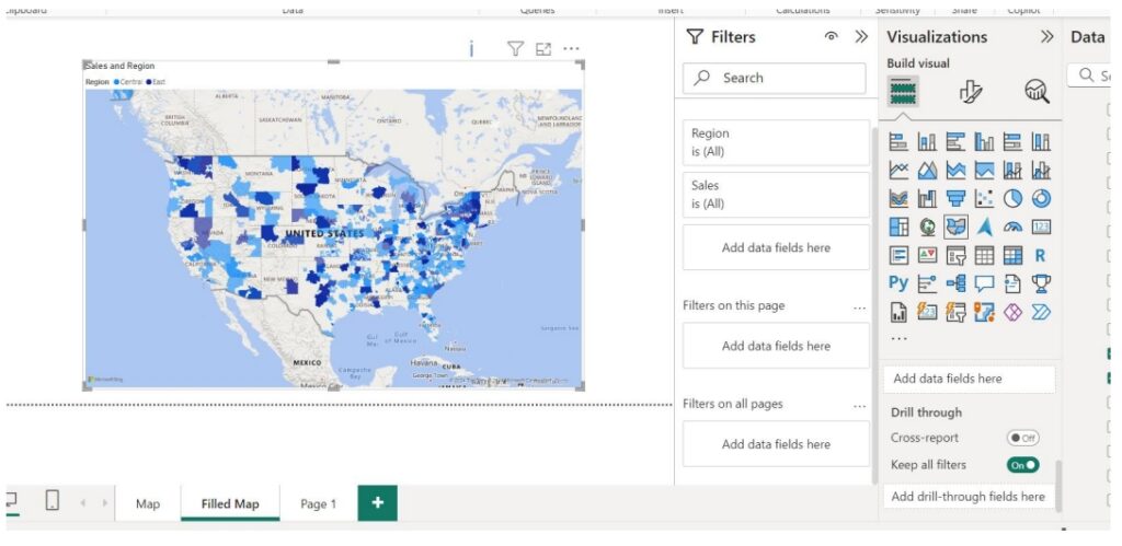
Step 2: Select the “Filled Map” from the visualization pane and select the verticals as per below:
“Location” → “Sales”
“Legend” → “Region”
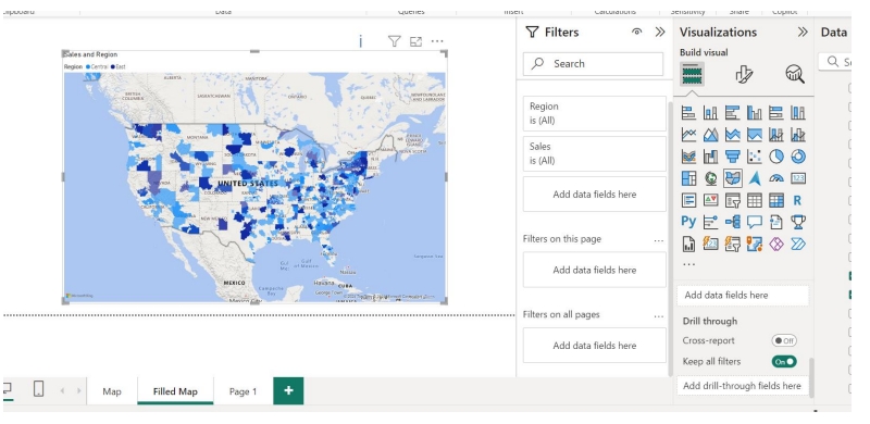
Output