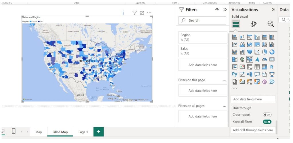
How to Create Maps in Power BI
Maps in Power BI offer powerful tools for visualizing and analyzing geographical data, making
presentations more engaging and informative. Users can create compelling visuals that enhance data-driven storytelling by leveraging its features
High level resolution steps
- Adding a “Basic Map” from set of visualizations.
- Adding a “Filled Map” from set of visualizations.
Detailed resolution steps
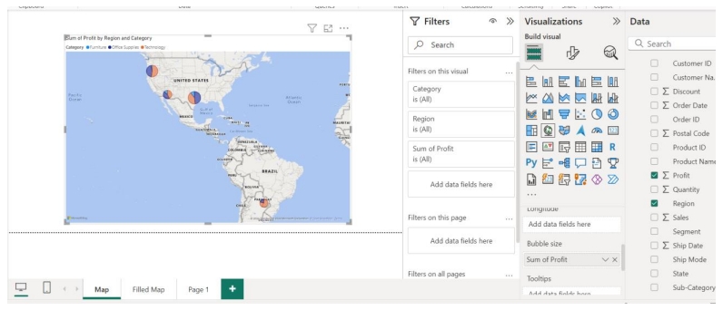
Step 1: Select the “Map” from the visualization pane and select the verticals as per below:
“Location” → “Region”
“Legend” → “Category”
“Bubble Size” → “Profit” to show the profit based on bubble size.
Step 2: Select the “Filled Map” from the visualization pane and select the verticals as per below:
“Location” → “Sales”
“Legend” → “Region”
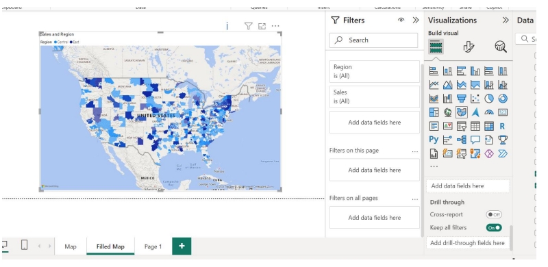
Output
This way you can Create Maps in Power BI.